Classic, redefined Brand identity and strategy // Experience design // Visual design // Motion design // Product design // Typography // Packaging, merch, OOH, retail // Art direction // More
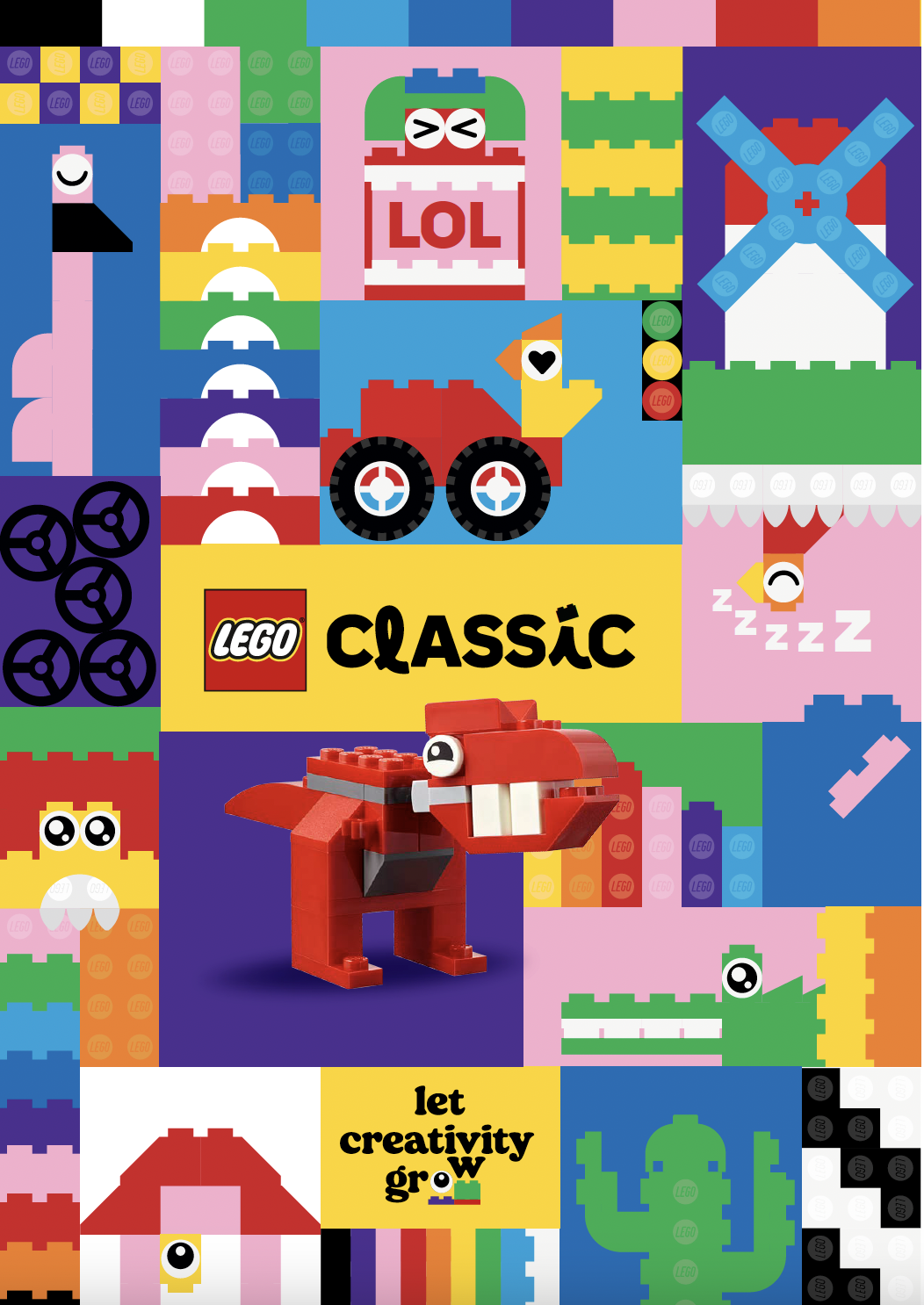
LEGO Classic: A classic, redefined.
Reinvigorating an icon through playful provocation.
I worked on a bold rebrand that's unapologetically provocative and cheekily classic: a stronger visual identity and tone of voice that aligns with LEGO's broader rebrand while standing uniquely on its own.
LEGO Classic is the "bread and butter" product line, representing the most essential form of the LEGO brick system-in-play. While reliable and best-selling, it lacked a strong, distinct personality compared to the more cinematic franchises.
Context
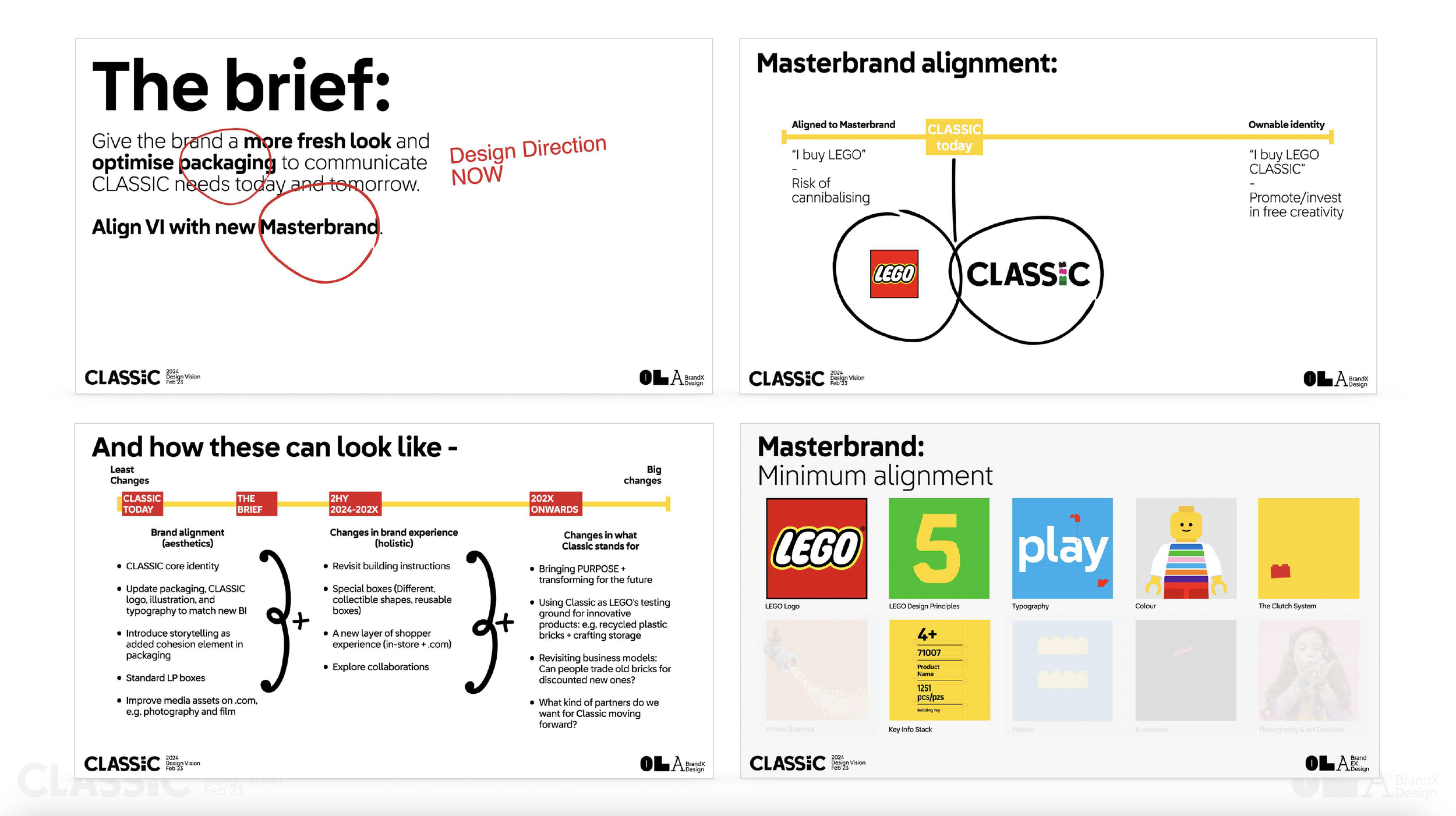
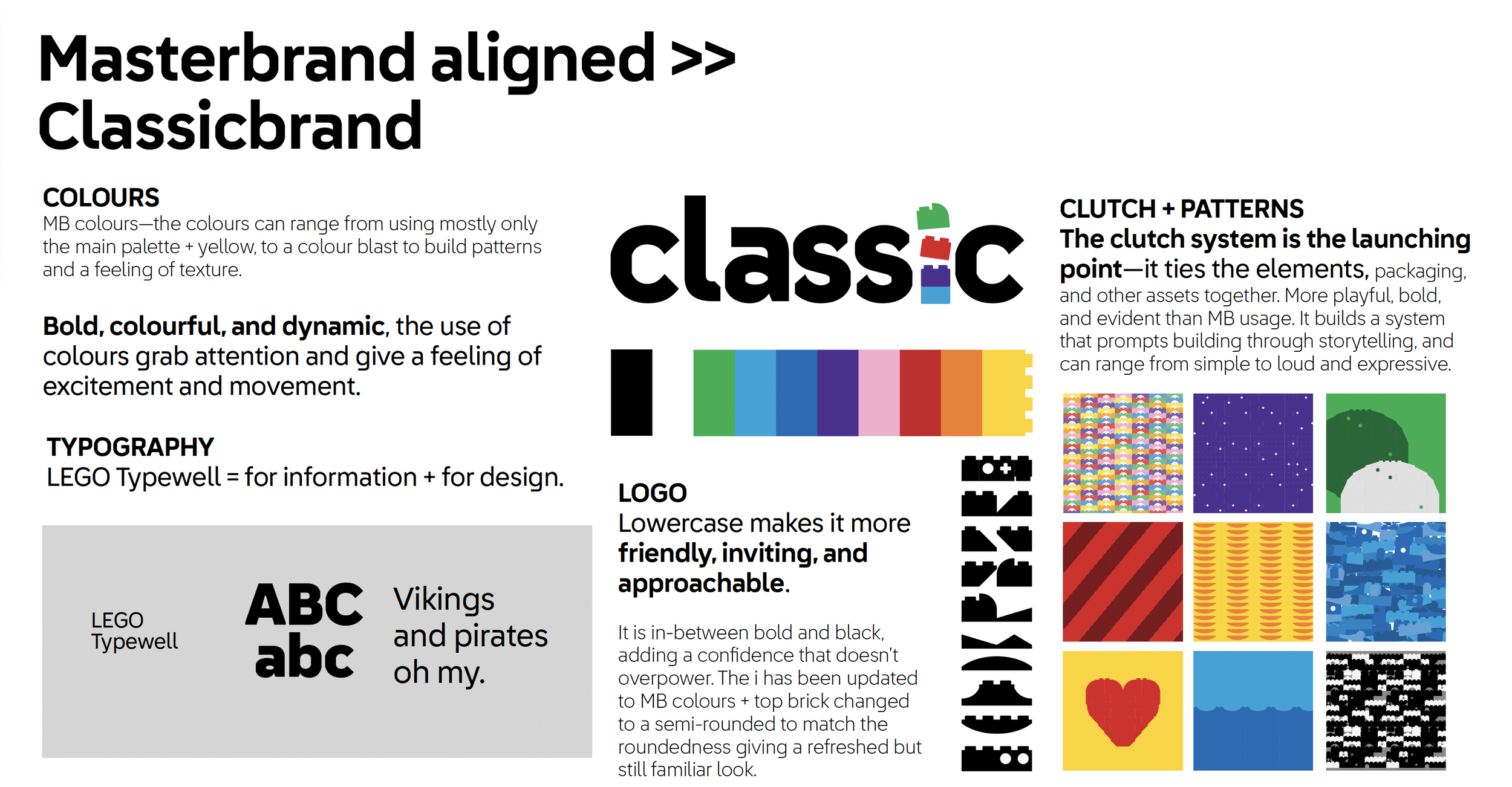
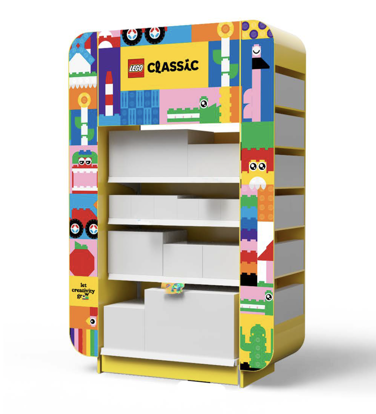
Update an iconic, beloved brand—specifically the "brick pile" on the packaging—without being disruptive to fans, while simultaneously making it feel uniquely unapologetic and bold.
Challenge


Strategy
My approach: Storytelling that prompts creativity, ditching strict instructions for pure imaginative play. From logo design to campaigns, working on LEGO Classic was pure play.
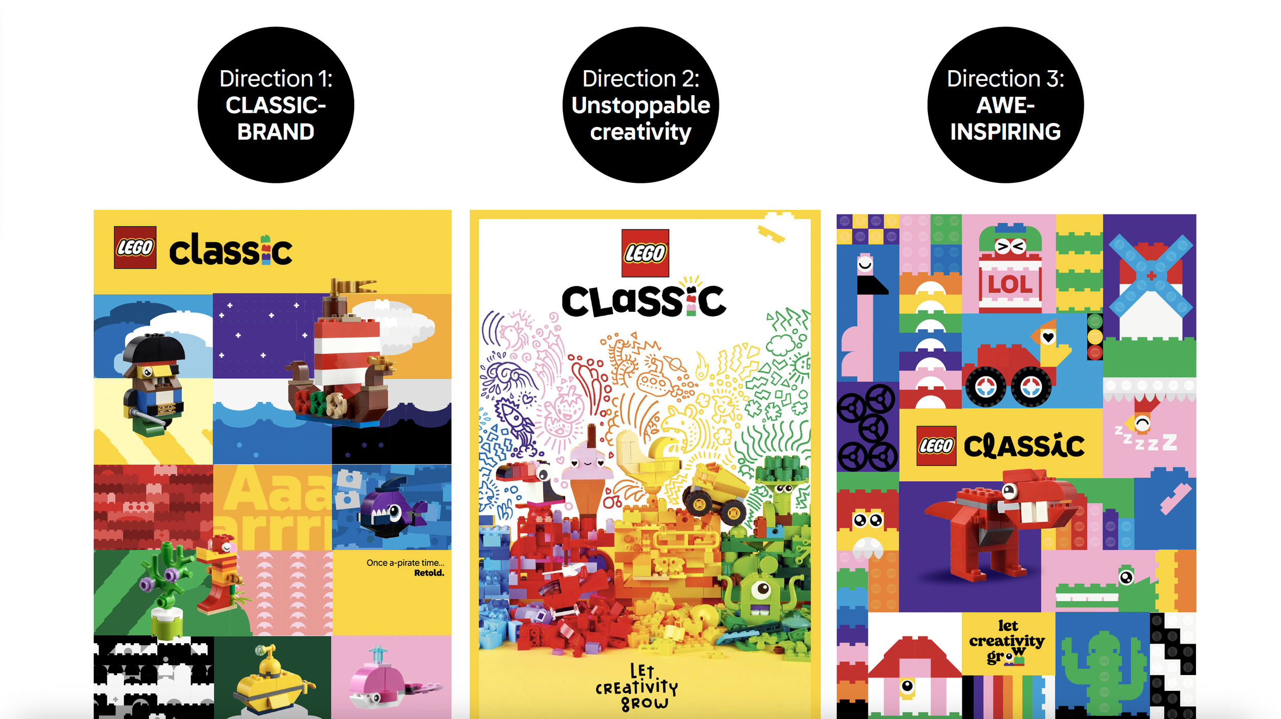
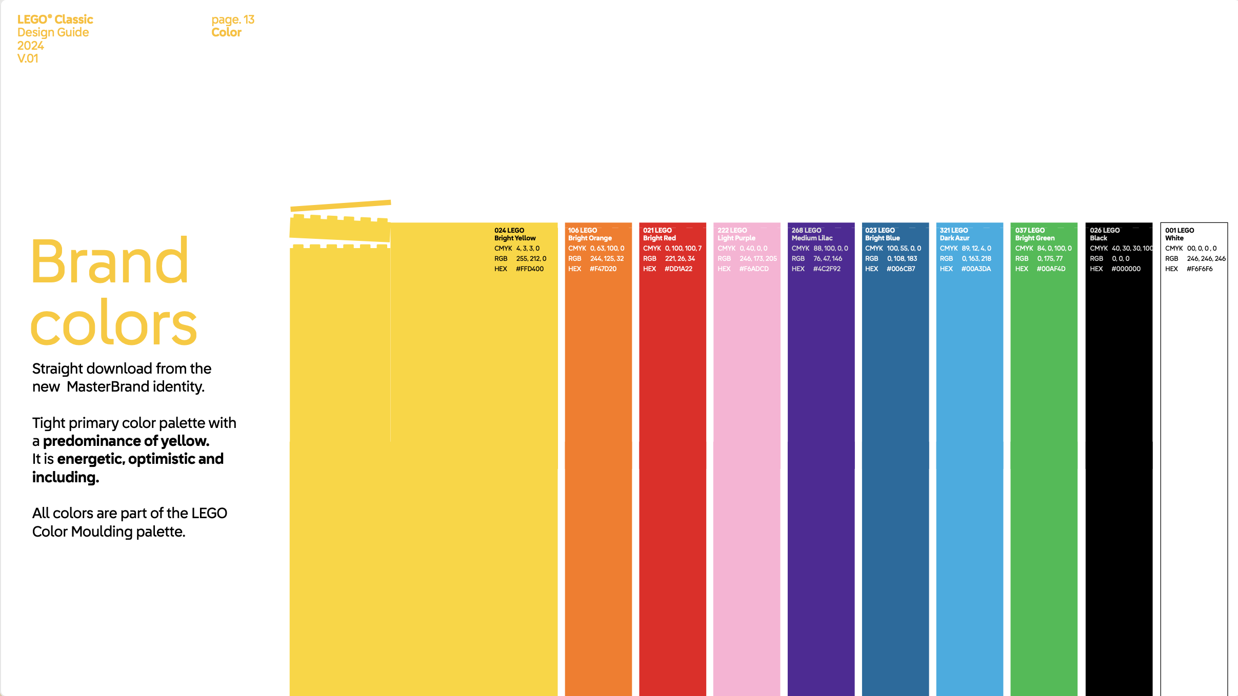
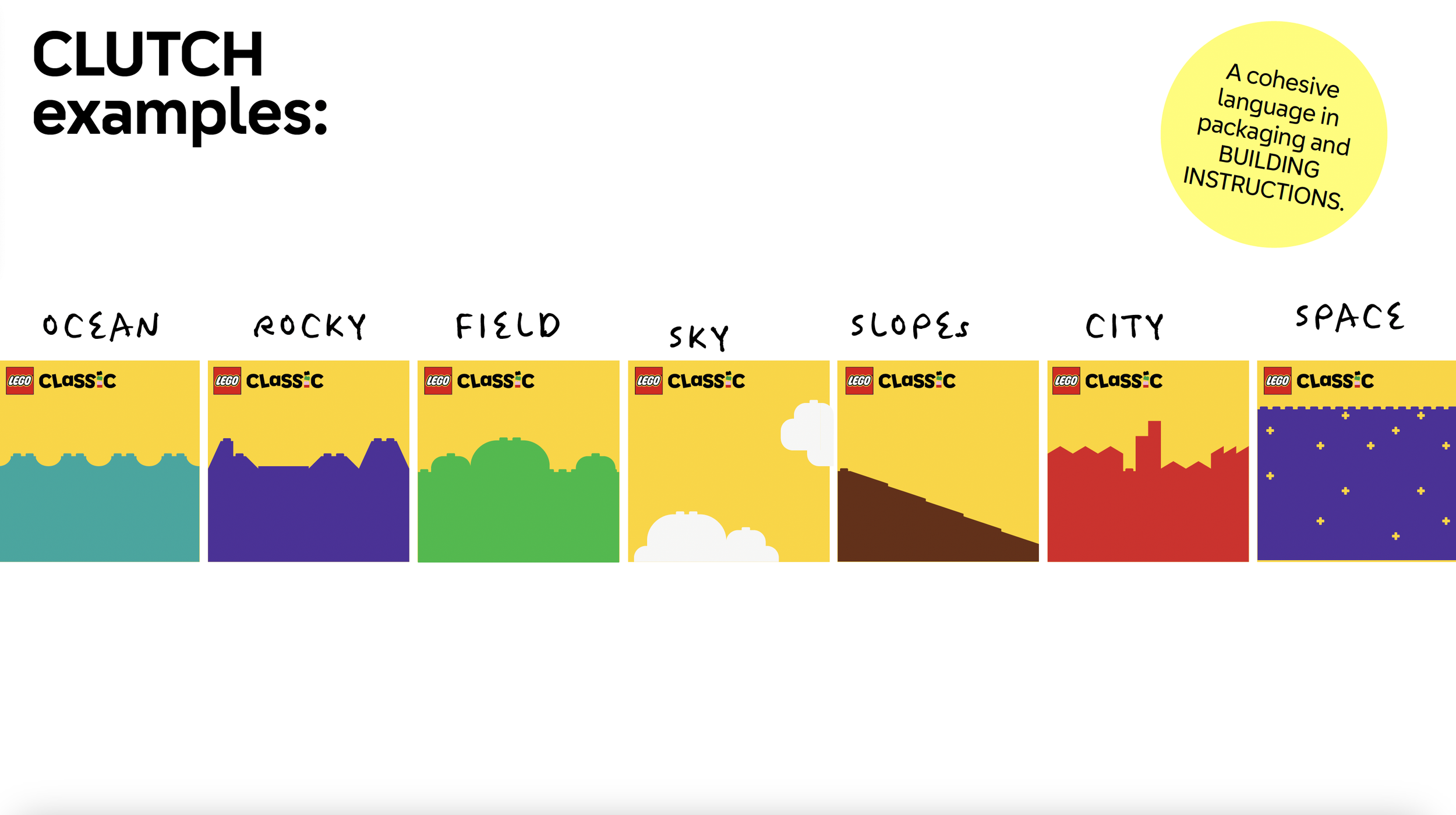
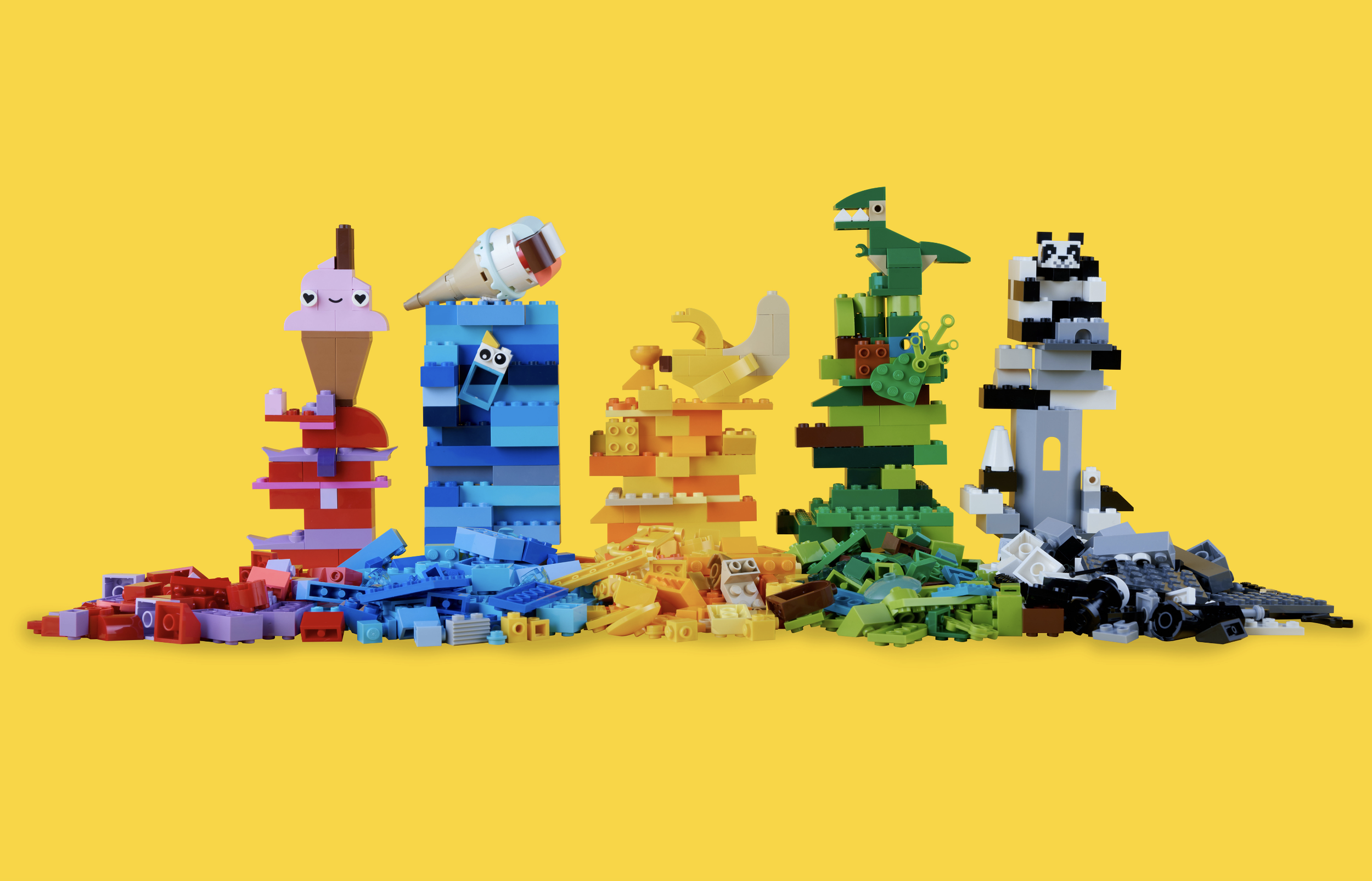
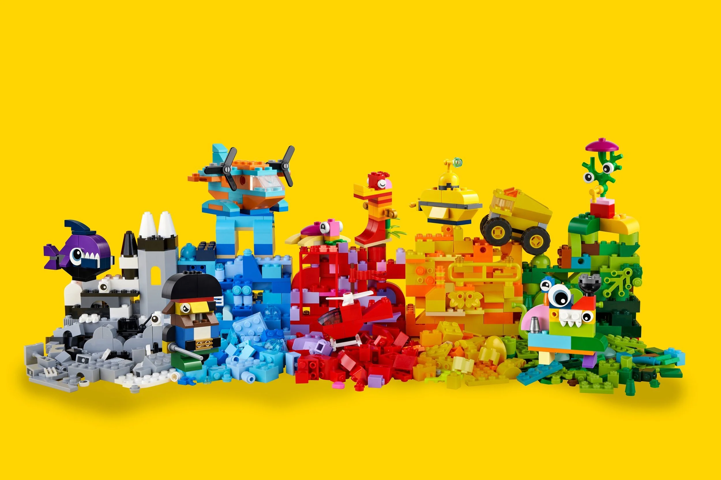
Visually: Combine structured "patterns and grids" (based on brick geometry) with open-ended storytelling cues that prompt pure imagination over strict instructions. It also provided an instant recognition and LEGO ‘look and feel’ by building a system of visual elements from bricks. It also gave endless possibilities: patterns and textures could be created to support products, themes, campaigns, from abstract to emphasising role-play.
There were two ways initially explored: one that focused heavily on storytelling and another that allowed more room for imagination with a structured mix of patterns and story cues. The end result became a fusion of both ideas.
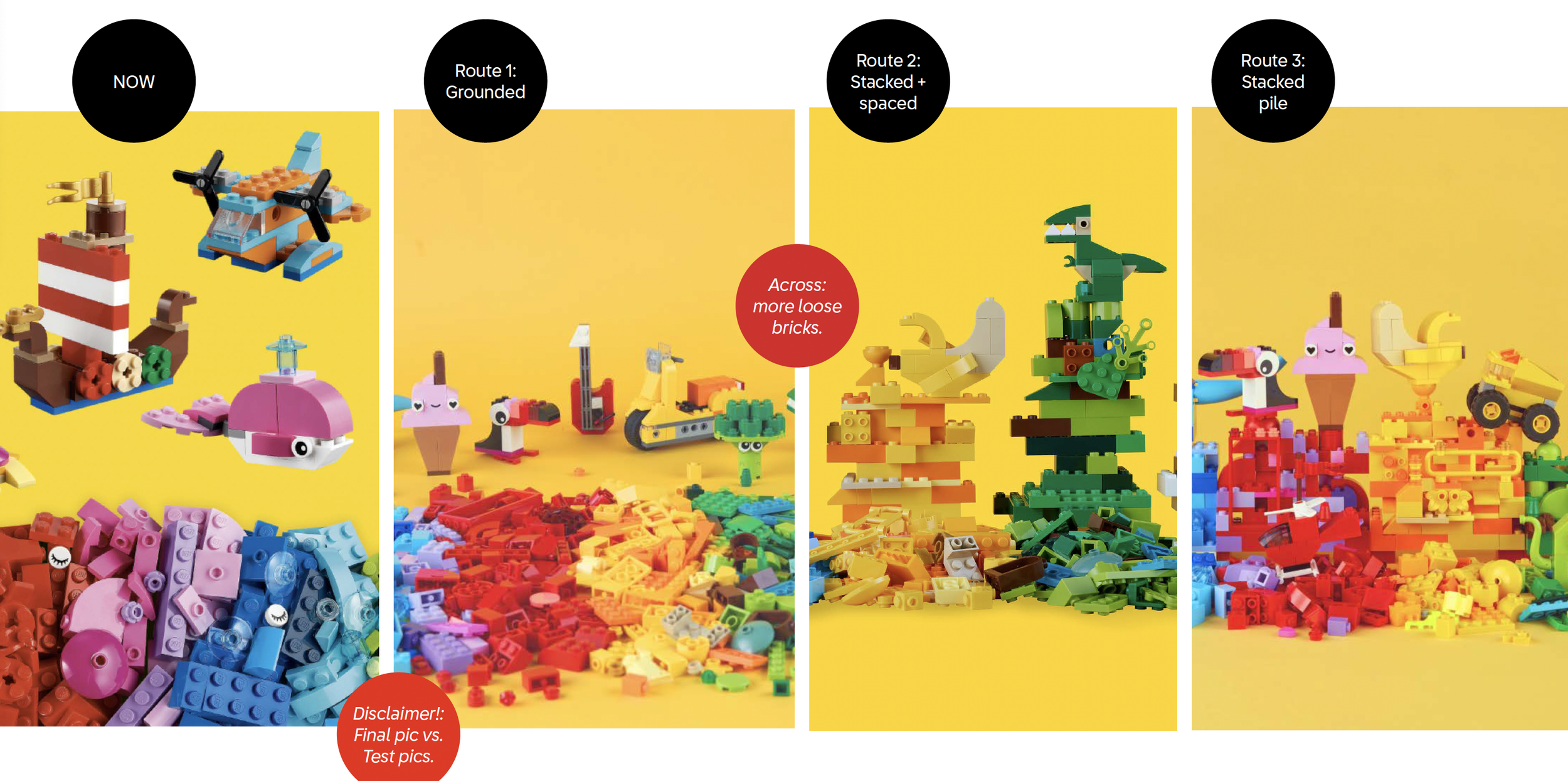
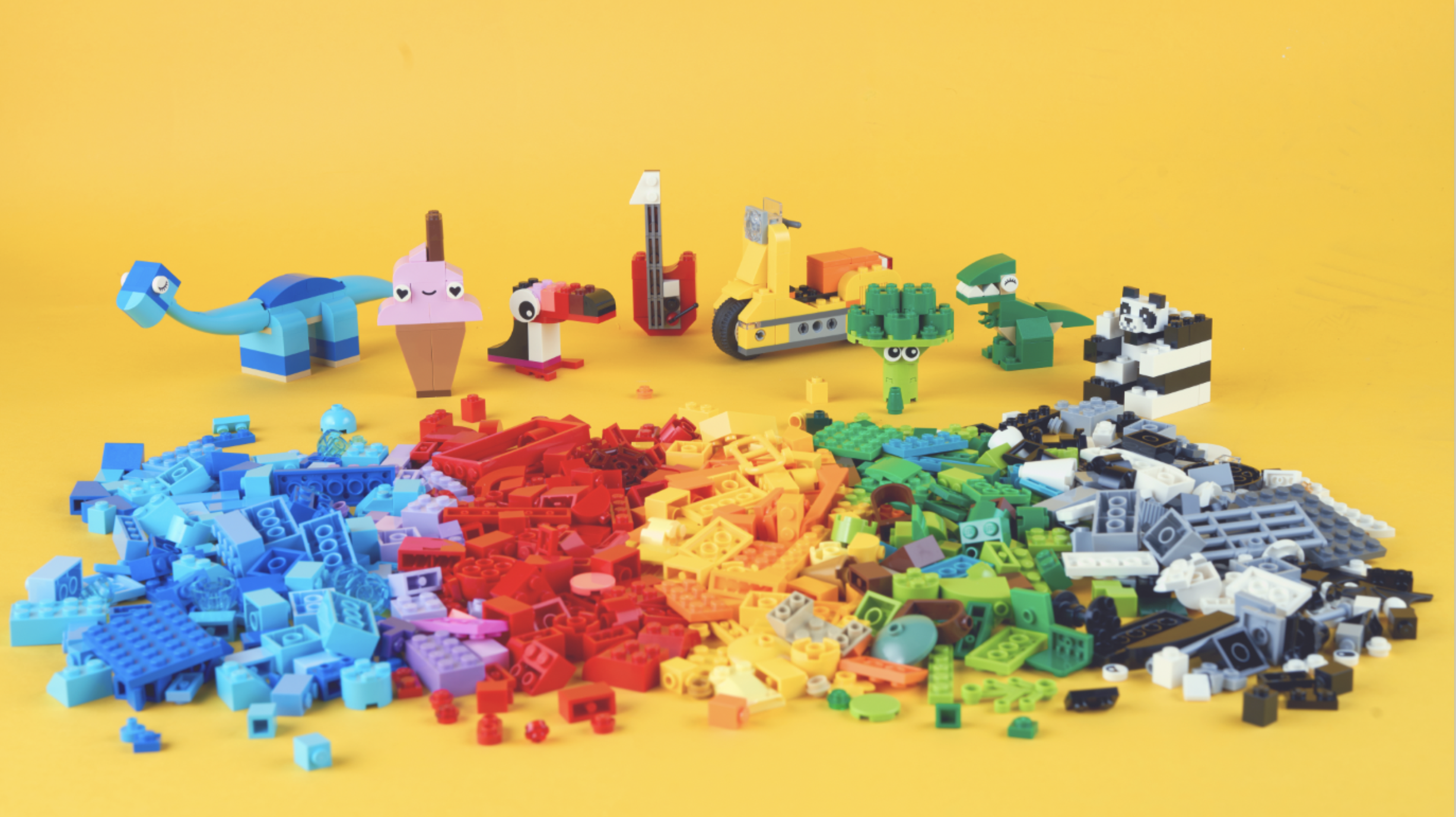
I developed a brand system that fused two directions: one purely imaginative and one with story-led cues. I led the testing of three "brick pile" options, discovering that while partially built-up piles were visually cleaner, loose bricks remained more creatively inspiring for the audience.
What I did
A redesigned 2024 visual identity and tone of voice that aligns with the global LEGO rebrand while standing uniquely as a provocative, cheekily "classic" experience.
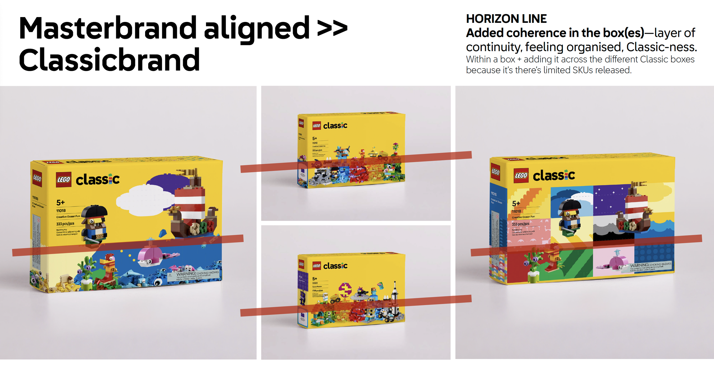
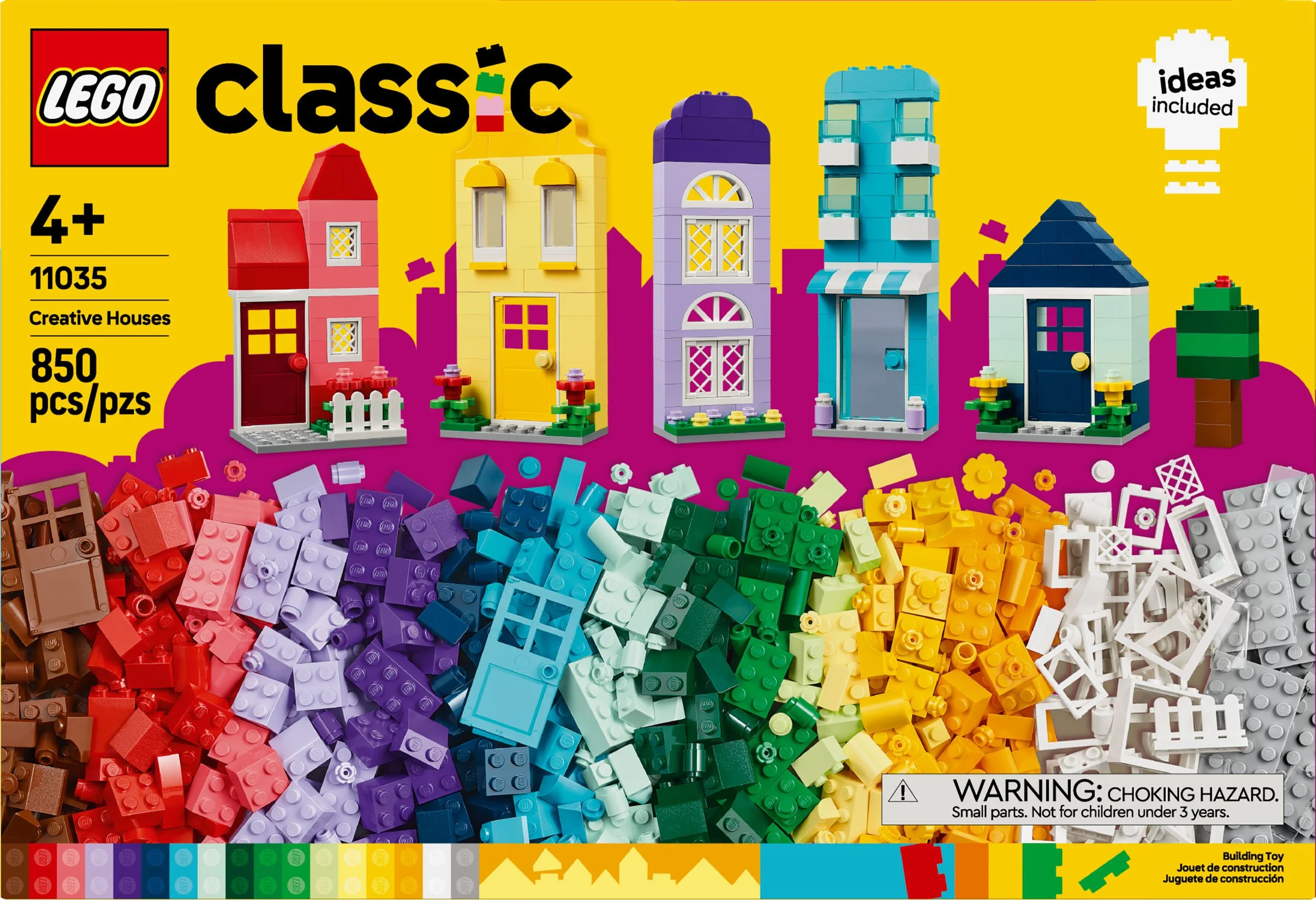
LEGO CLASSIC is the bread and butter product line, and is meant to be the one closest and most representative of the master brand and brick system-in-play. This also meant that it is iconic, from the logo to “brick pile”, which is how the bricks are presented in the packaging—and updating these was a challenge to not be disruptive for the LEGO fans (as it is beloved) but also contribute to the appeal.
The brick pile underwent three options and test: maintain as is but more cohesive following the rainbow blend, a partial build-up of the bricks with more breathing room, and a heavier build-up of the loose bricks to give a “full box” look and feel. This produced interesting test results—despite partially built-up piles being more visually appealing, completely loose bricks still felt more creatively inspiring.
Outcome
The new identity also had to play well with other products and campaigns.
Re-working such a deeply love brand and product line was a challenge, but a fun one at that, and it has proven to be very welcomed by both long-time AFOL (Adult Fans of LEGO) and new builders.
Comparison of the old LEGO Classic box and the 2024 redesigned box.
Left photo credit to the Bricknerd. Some of the bottom executions for final art credited to the OLA Graphic Art team and Ana Palasi.

>> See LEGO’s new global brand identity which I also worked on, and led to this LEGO Classic rebrand. <<
Tags: Brand identities and strategies // Brand governance // Experience design // Packaging, retail, OOH // Visual design // Product design // Motion design // Campaigns // Art direction // Photography // MORE
