Crypto. Meme-fied. Brand identity and strategy // Visual design // Product design, UX, UI // Art direction // Typography // Adcepts
Spot: Embracing internet culture to drive crypto adoption.
#LMSTFY. Let me Spot that for you.
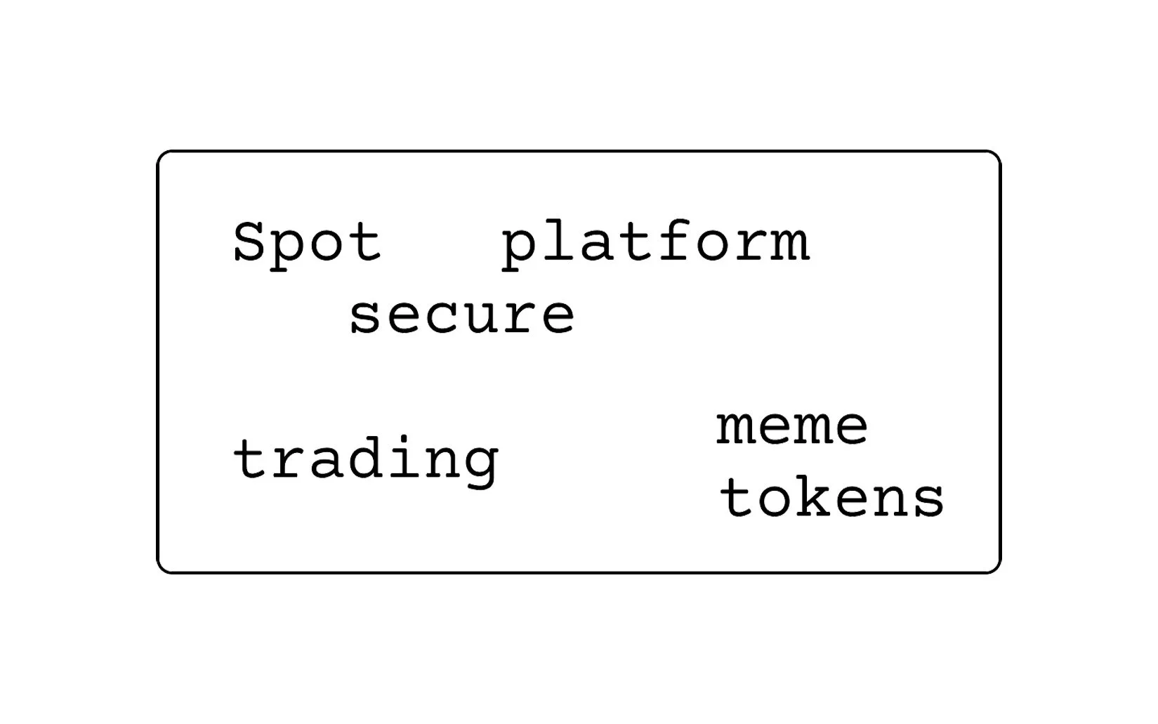
Spot is a start-up in the cryptocurrency space, with a unique focus on meme tokens and AI-informed, personalised crypto recommendations based on user preferences/interests, previous behaviour, and market sentiment.
Emerging crypto projects often struggle with visibility in a saturated market and a lack of relatability for younger, meme-literate audiences.
Putting emphasis on memes as part of the Spot brand—both to appeal to the specific audience they have in mind, and in defiance of standard financial institutions –, the goal of Spot is to be witty but direct in both messaging and UX. What, why, and how: meme (coins) edition
Context

Challenge
Launch a project that feels authentic to "internet culture" while maintaining the credibility of a serious financial tool.
Strategy
"Crypto. Meme-fied." The strategy focused on a vibrant, high-energy visual language that leans into digital humor and community-led trends.
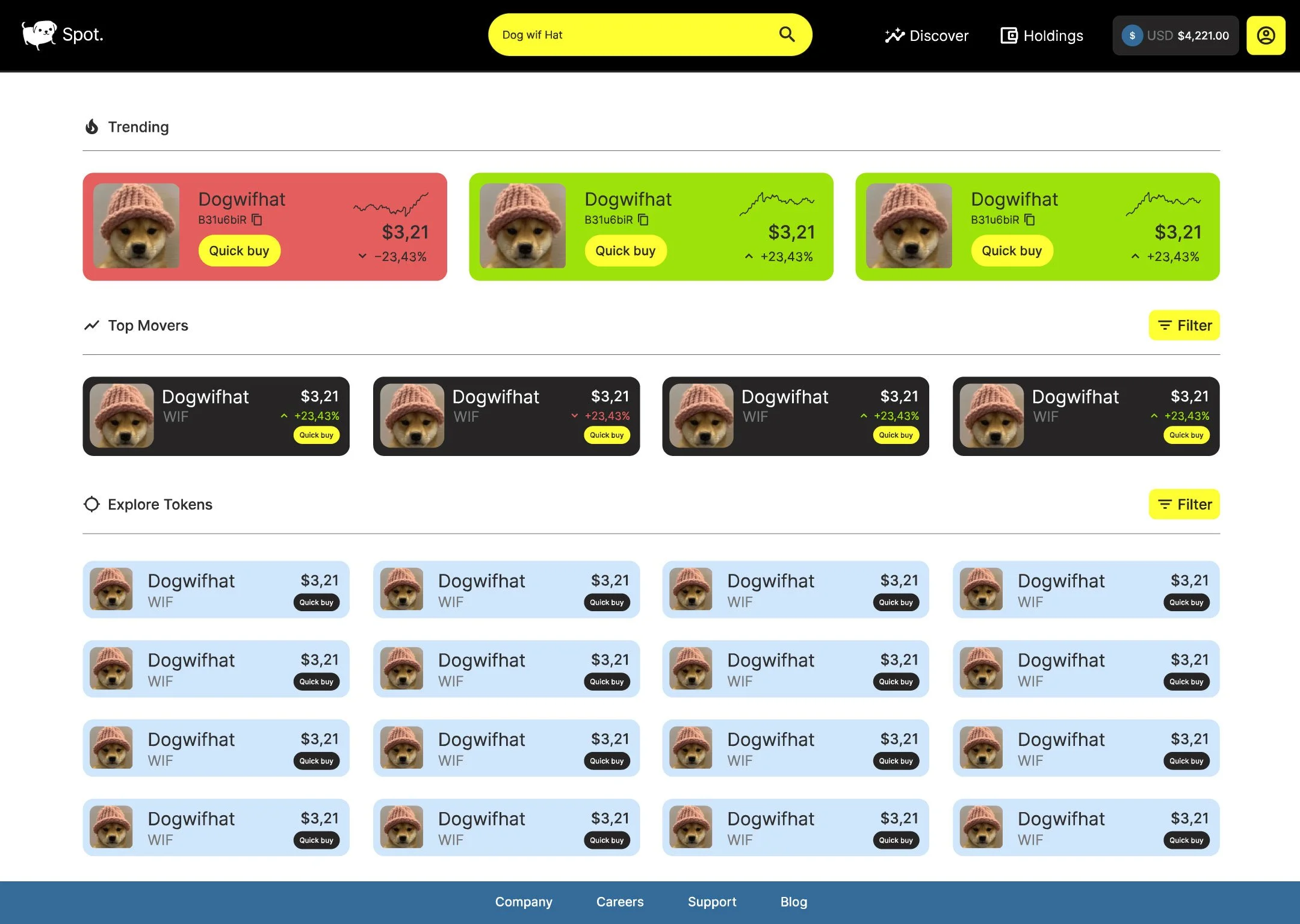
The use of vibrant colours together with the early 2000s retro-style gave a distinct familiarity and let the brand standout in the see of corporate look and feels,
and gave room for a friendliness and openness that is usually ignored by banks. It’s a breath of fresh, confident, quirky air.

What I did
I owned the brand identity and strategy, visual design, and tone of voice/initial communications strategy. I developed specific "adcepts" and art direction that mirrored social media aesthetics to ensure the brand felt native to platforms like X (Twitter) and Reddit.
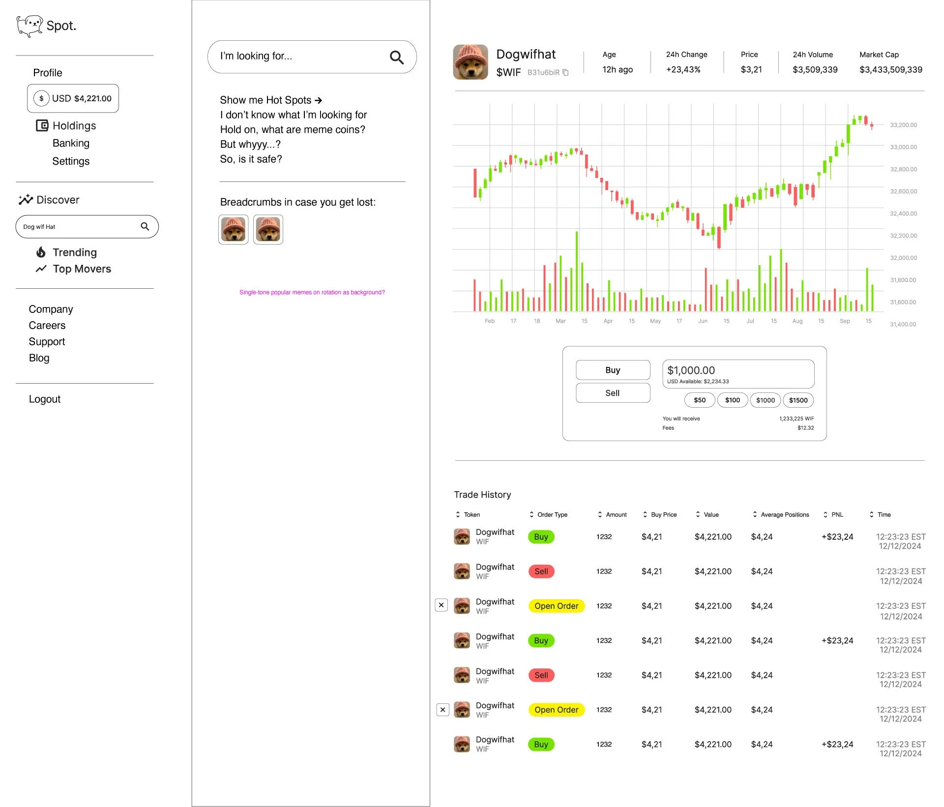
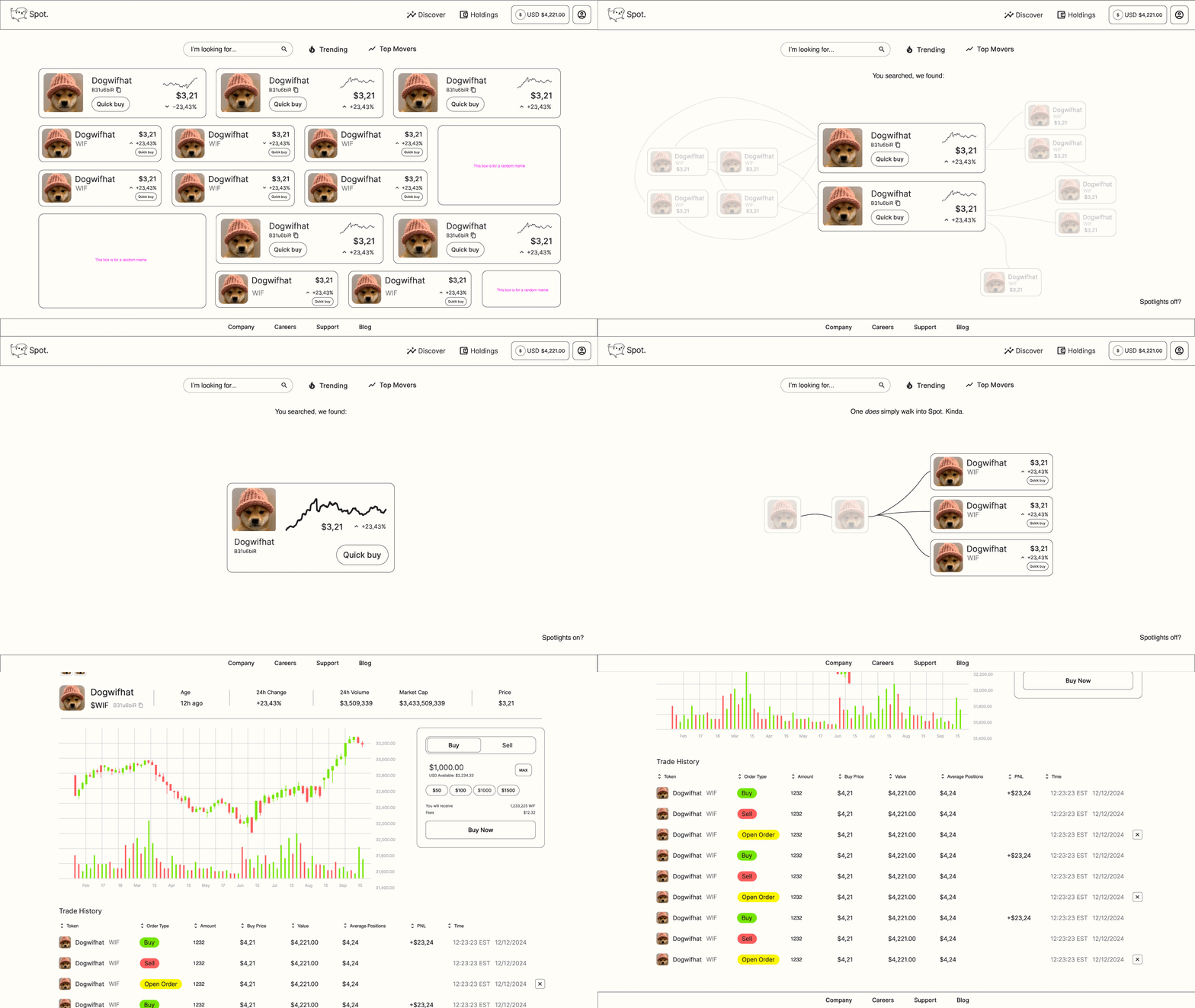
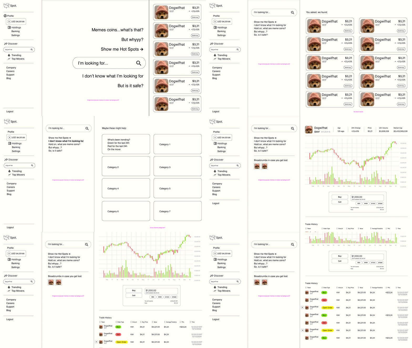
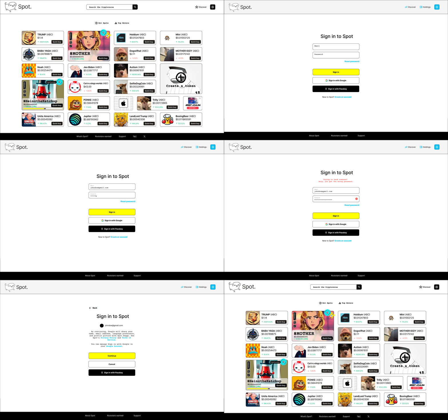
I also worked on the product design, from UX research to website pages. The founders initially wanted a standard crypto/banking website, but it didn't capture their brand's true personality. I whipped up some initial ideas to spark deeper conversations about their product vision. This led to creating wireframes, user journeys, etc. helping map out the platform's features and user experience from the ground up.; a quirky-but-still-corporate brand identity. And a lot of rejections and iterations.







Outcome
A highly recognisable brand identity that stands out in the crypto ecosystem through a unique blend of humour and high-end visual design.
Played around with campaign launch ideas and materials, from bright stickers that play with familiar icons and emojis to grab attention, to spoofing familiar (public domain) works, more specific activations triggered by consumers to leave imprints, to subtle but community-building merchandise:
Spot’s the spot.
Tags: Brand identity and strategy // Tone of voice, communications strategy // Visual design // Motion design // Product design, UX, UI // Campaigns, adcepts // Illustrations


